ClientRFM Beverage and Food Group
CategoryPackaging Design
Year2013
Project Overview
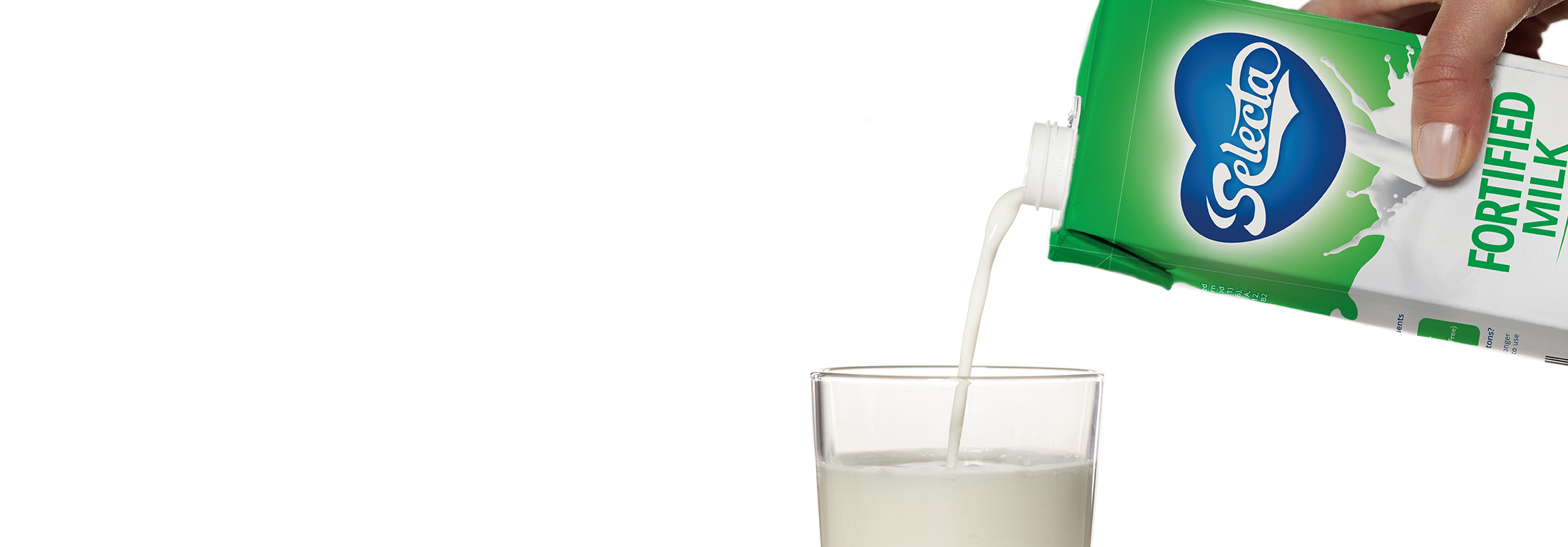
To refresh the packaging design of Selecta Milk to help further communicate its change of formulation.
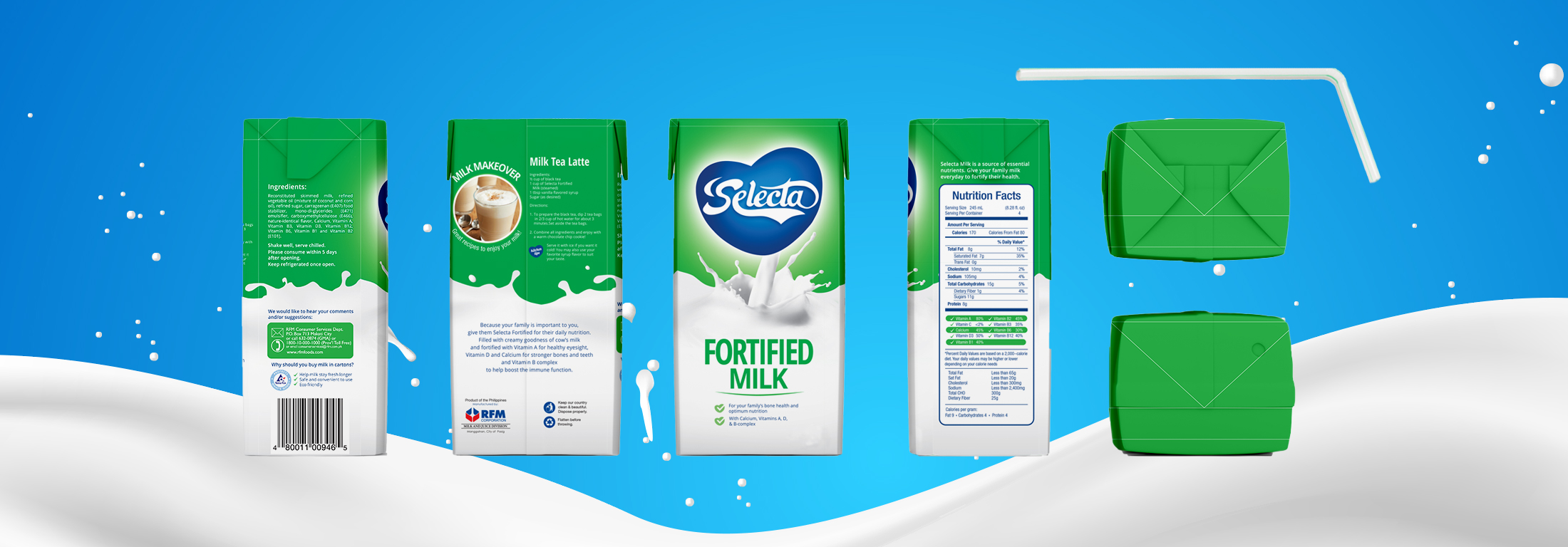
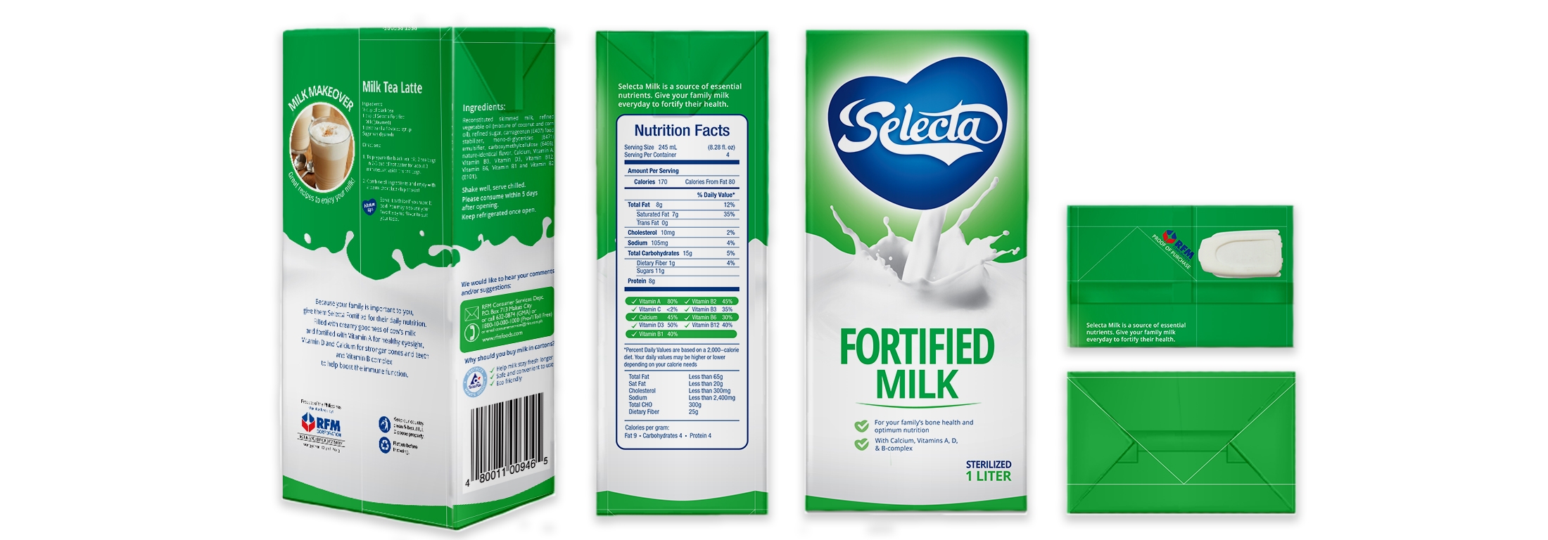
About the Project
The client sought to revamp the packaging design of their milk beverage line in conjunction with its reformulation. It had to be eye-catching on grocery shelves and appeal to moms and kids alike.
We made the Heart logo more prominent to make it more distinguishable on shelves and we used legible fonts in all-caps for the name “Fortified Milk” to give it more impact.
The low-fat variants had the same fonts with narrow type to project lightness, and we stylized the letter “i” in LIGHT to appeal to women and weight-watchers.
We’d love to hear about your project!
get in touch with us